Close the gap: How to boost parity between Figma and code
Want your Figma components to match code without the endless back-and-forth? This guide breaks down practical ways to boost design-code parity—from tokens and props to structure and states—so designer
Let’s Recap…
In case you missed the last article, parity is how closely Figma components match their coded counterparts. The higher the parity, the smoother the design-to-dev workflow—fewer surprises, less guesswork, and a more consistent product.
But not all components need pixel-perfect parity. It’s about finding the right balance between design experience and engineering efficiency. Let’s break down how to get there.
Why high parity matters
Faster Handoffs – When designers and engineers speak the same language, there’s less back-and-forth. What’s in Figma is what’s in code.
No More "Throwing It Over the Fence" – Design and engineering are merging. The closer they work, the smoother (and more consistent) the final product.
Future-Proofing – AI is bridging the design-code gap. The more aligned your components are now, the easier it’ll be to tap into automation later.
Things to keep in mind
Maintenance Overhead – Keeping design and code in sync isn’t free. Without automation, it’s a manual (and sometimes painful) process.
Cross-Platform Headaches – What works on web won’t always translate to native mobile. If your design system spans multiple platforms, expect extra complexity.
Ways to increase parity
Let’s talk about making your Figma components match code more closely. I’ll break it down using a Button (because everyone has one) and a Modal (because generally a large composition). I’ll go through various aspects of the component you can alter to match code.
Visual
Design tokens
Obvious but essential—design tokens need to match code exactly. If a developer is using primary.default, don’t call it Primary/Main in Figma. Standardized naming means zero guesswork and smoother handoffs.
👉🏻 How to increase parity: Leverage Figma’s code syntax to define the exact token definition an engineer will implement. You may need to make concessions in design for a better experience: You may notice that the .default is removed between design and code. This was a conscious decision to improve the grouping of relevant variables together (default, hovered, pressed)
Metadata
Namespaces
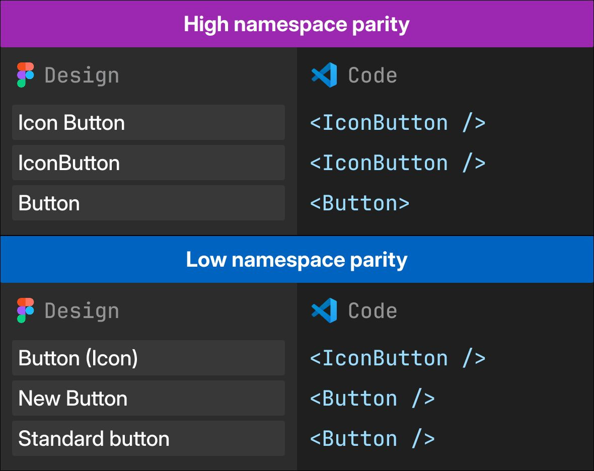
In code, components are given namespaces (usually in camelCase) so they can be easily referenced e.g <Button />. Keeping Figma component names identical ensures designers and developers are always talking about the same thing—no guessing, no mismatches.
👉🏻 How to increase parity: Check your design system documentation or speak to a developer about what they’ve named the component, then match it.

Documentation links
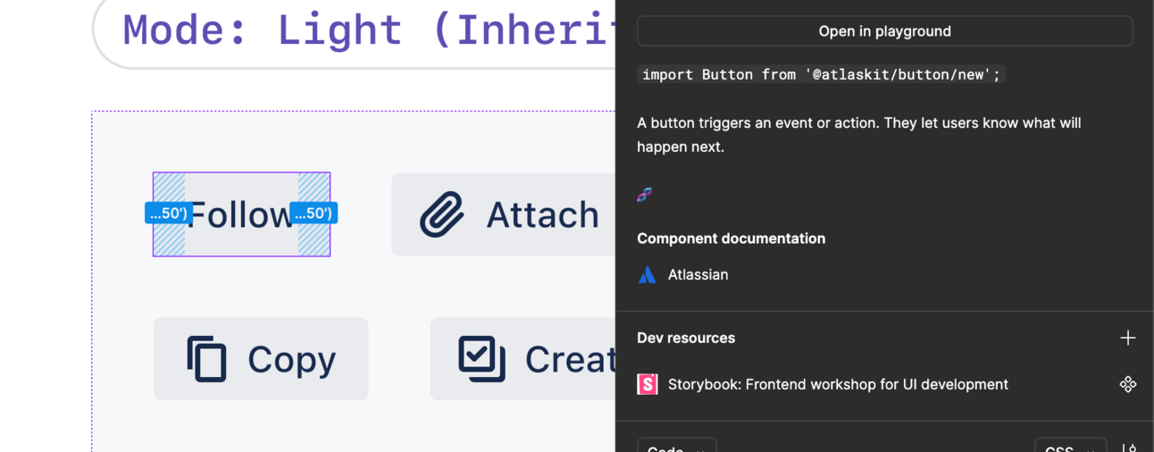
Make life easier for engineers—add links in Figma to the coded version of a component. Whether it’s a Storybook URL, repo link, or documentation, quick access means fewer questions and faster implementation.
👉🏻 How to increase parity: Add a link to the documentation in component description, and include any extra metadata like package name.

Architecture
Page infrastructure
How you organize your Figma pages can make or break usability. Keep your Figma library structured like your code documentation—the more alignment, the less confusion when jumping between the two.
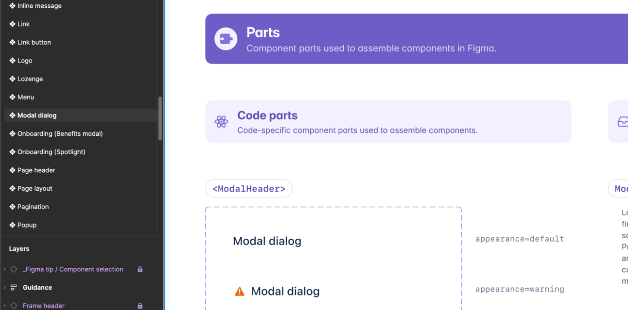
👉🏻 How to increase parity: Create one page per component. If more sub components live inside the main component then group them together for easier discovery and better connection.
Each component had its own Figma page, with the name matching the component namespace in code.

📓 Extra curricular: Romina from Design System Guide goes into more detail on Figma file organization
States
Interactive states (like hover or press) are tricky to match 1:1. In code, they’re often handled via stylesheets, not the component API. In Figma, there’s no native state system either, so the workaround? Variants. Naming a component property "state" and creating variants manually keeps things aligned.
Not all states are created equal. Some—like error, success, disabled, and selected—are handled directly by the component’s API. Others rely on external stylesheets. The catch? It all depends on how the component is set up in code.
Here’s a breakdown of common Button states and whether they live inside or outside the state prop:
👉🏻 How to increase parity: Inspect your components in code and work out what states are controlled by apis, then use the state prop for everything else.
📓 Extra curricular: Nathan Curtis expands on state best practice here.
Props
Also known as properties, these configurable parameters exist in Figma, React code and some native mobile code. Most properties are easy to match 1:1 since they are an array on strings (text) but there are some tough ones (like states)
Challenge: Handling null with props
Some props are easy to match between design and code—but null isn’t one of them. In code, null just means "nothing." In Figma, there’s no clean way to represent it because every prop needs a defined value.
Take a Button with an optional icon—in code, you just leave the icon prop empty. In Figma? Not so simple.
👉 How to increase parity: Use two props—one boolean (iconBefore) and one instance swap (↳ <Icon>). That way, the instance swap only appears when the boolean is true—keeping things clean and predictable. Bonus: Use an enter arrow to visually connect the two props for better UX.
The user would then toggle on the prop iconBefore and the instance swap prop would appear underneath. This solution allows support for both null and defined icons.
💡 Why we use <Icon>: this is something that most designers won’t notice, but we like to use <> to show its a sub component in code. It’s not imperative but it increases the level of parity.
Challenge: Props for dynamic content
Figma doesn’t let you create a true "drop anything here" area inside a component. Instead, you’re stuck using the Instance Swap panel to pick from predefined options. This makes components like Modals tricky, since in code, they’re just wrappers for any content.
👉🏻 How to in increase parity: Use a slot technique—an instance swap placeholder with preferred values. Not perfect, but the best way to mimic the flexibility of code.
Structure and layout
Every component has an underlying structure and layout—whether it’s styled HTML elements or native mobile components. To increase parity, mirror the coded structure in Figma. This makes future updates easier and keeps everything in sync.
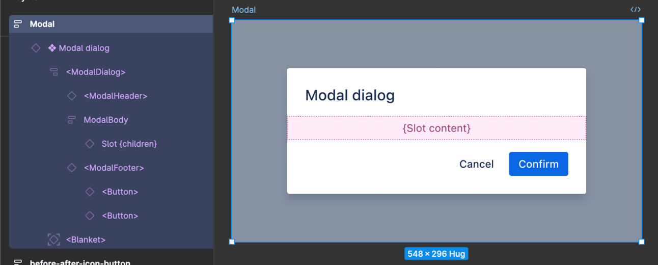
👉🏻 How to in increase parity: lf you have layout primitives try to match the primitive used using Autolayout and name to match code. If you don’t, name the layers something semantic like “container” or even better, the class name of the element in code.
Sub components
Most components are built from smaller parts, but some—like modals or page layouts—have exclusive subcomponents. To keep parity high, match their composition, structure, props, and tokens in Figma. That way, when things change, designers and engineers stay in sync.
👉🏻 How to in increase parity: Inspect the code to find the sub components, then match them as. much as possible in Figma. Each sub component can be its own Figma component if necessary. Check out our Modal for inspiration

Unification
Code connect
Figma’s Code Connect lets engineers access coded components without leaving Figma—a game-changer for parity. The catch? It’s not automatic. You’ll need to manually set up and maintain those connections to keep everything in sync.
👉🏻 How to in increase parity: Read the documentation to understand how to connect your components, A. hot tip, if you follow the guidance above to increase your levels of parity it will be a lot easier to set-up.
Examples
Every example in Figma should have a coded counterpart in your documentation. When examples exist in both places, designers and engineers stay aligned, making it easier to reference, build, and maintain consistency. Some call these UI recipes—prebuilt setups that connect design and code.
👉🏻 How to in increase parity: Inspect your design system documentation and ensure any example exists in Figma too.
Accessibility and annotations
Make sure all annotations clearly show how components interact with tab index and other accessibility features. If it’s defined in code, it should be reflected in Figma. This keeps designs usable and devs aligned.
👉🏻 How to in increase parity: Use an accessibility annotation kit to mark up your components in your design systtem Figma library according to what is in production.
Tooling
Automation
Chris Strahl recently shared his take on automating design-to-code, and here’s the gist: we’re not there yet. No tool can magically turn static Figma files into dynamic, design-system-backed code—but AI is getting closer.
Some exciting projects showing promise:
How would you rate this newsletter?
Your honest feedback helps me improve


